Credit Card Customers Exploratory Analysis and Churn Prediction Model
Our client, a bank, is concerned that increasing number of customers are leaving their credit card services. They would really appreciate if we could help them solve this problem. In particular, the client is interested in being able to predict which of their customers are most at risk of churn so that they can proactively go to the customer and turn them around before the customer leaves.
Table of contents
- 00. Project Overview
- 01. Data Overview
- 02. Modelling Overview
- 03. Exploratory Analysis
- 04. Random Forest
- 05. Application
- 06. Growth & Next Steps
Project Overview
Context
Our client, a bank is concerned that increasing number of their customers are choosing to leave their credit card service, a service which has been highly profitable for them. They have provided us with a dataset containing attributes of its current and past customers and have requested our help to improve the retention rate of their customers. Specifically, they are interested in being able to predict which of their customers are most at risk of churning so that they are able to proactively approach such customers before they churn. The client is also interested in understanding the drivers behind their customer churn so that they can improve their product, thereby also reducing customer churn.
We will use Python for the exploratory analysis and Machine Learning for this specfic task.
Actions
With the dataset provided by the client, we found that 84% of the customers actually stayed with the bank while only 16% chose to terminate their credit card service with the bank. This is a highly unbalanced dataset but it is also not unusual in most business cases. As we will be predicting a binary output, we will use a Balanced Random Forest for our classification modelling approach. As explained in my previous blog, Random Forest is partcularly good at making predictions if you have a lot of data with many features. It is a robust model using the prediction of many decision trees. Each decision tree looks at a different subset of the data and features and then makes its own prediction. The Random Forest algorithm combines all the predictions made by taking the majority vote. The Balanced Random Forests algorithm works pretty much the same way as the Random Forest algorithm but it is specifically designed to handle imbalanced datasets. It uses a modified sampling approach where it balances the number of samples in each class by either oversampling the minority class or undersampling the majority class.
As the client is also interested in the drivers behind their customer churn, we will also look at both Feature Importance and Permutation Importance to understand the key drivers behind the customers leaving the credit card service.
Finally, as the dataset is highly unbalanced, we will also ensure that we do not rely on the classification accuracy alone when assessing the results. We will also be analysing Precision, Recall and the F1-Score. We will import the data but will need to pre-process the data based on the requirement for the Balanced Random Forest algorithm. We will then train and test the model and then measure the predictive performance using Classification Accuracy, Precision, Recall and F1 scores.
Results
Balanced Random Forest was chosen as the model due to its robustness and that it will allow the client to understand the key drivers behind their customers leaving their credit card service. It’s predictive performance are summarised as follows:
Metric 1
Classification Accuracy = 0.951
Metric 2
Precision = 0.794
Metric 3
Recall = 0.935
Metric 4
F1 Score = 0.859
Growth/Next Steps
While predictive accuracy was relatively high - other modelling approaches could be tested, especially those somewhat similar to Balanced Random Forest, for example XGBoost, LightGBM to see if even more accuracy could be gained.
From a data point of view, further variables could be collected, and further feature engineering could be undertaken to ensure that we have as much useful information available for predicting customer churn.
___
Data Overview
We will be predicting the binary Attrition_Flag metric from the dataset provided by the client. The client has also requested that the last 2 columns of the dataset be deleted. These were the column names ‘Naive_Bayes_Classifier_Attrition_Flag_Card_Category_Contacts_Count_12_mon_Dependent_count_Education_Level_Months_Inactive_12_mon_1’ and ‘Naive_Bayes_Classifier_Attrition_Flag_Card_Category_Contacts_Count_12_mon_Dependent_count_Education_Level_Months_Inactive_12_mon_2’
The provided dataset (less the 2 deleted columns) contains the following fields…
| Variable Name | Variable Type | Description |
|---|---|---|
| CLIENTNUM | Independent | Unique identifier of the customer holding the account |
| Attrition_Flag | Dependent | The values are ‘Attrited Customer’ or ‘Existing Customer’ |
| Customer_Age | Independent | customer age in years |
| Gender | Independent | The gender of the customer, categorised as M for Male or F for Female |
| Dependent_count | Independent | Number of dependents |
| Education_Level | Independent | Educational qualification of the account holder |
| Marital_Status | Independent | The marital status of the customer. Values are Married, Single, Divorced or Unknown |
| Income_category | Independent | Annual Income of the account holder - <$40k, $40k - 60k, $60k - 80k, $80k - 120k, >$120k |
| Card_Category | Independent | The type of card the account holder has - Blue, Silver, Gold or Platinum |
| Months_on_book | Independent | The period of relationship the account holder has with the bank |
| Total_Relationship_Count | Independent | The number of products held by the customer |
| Months_Inactive_12_mon | Independent | The number of months inactive for the last 12 months |
| Contacts_Count_12_mon | Independent | The number of contacts in the last 12 months |
| Credit_Limit | Independent | The credit limit of the account holder on the card |
| Total_Revolving_Bal | Independent | The customer’s total revolving balance on the credit card |
| Avg_Open_To_Buy | Independent | The open to buy credit line that is averaged for the last 12 months |
| Total_Amt_Chng_Q4_Q1 | Independent | Change in transaction amount (Q4 over Q1) |
| Total_Trans_Amt | Independent | The customer’s total transaction amount over the last 12 months |
| Total_Trans_Ct | Independent | The customer’s total transaction count over the last 12 months |
| Total_Ct_Chng_Q4_Q1 | Independent | The customers change in transaction count (Q4 over Q1) |
| Avg_Utlisation_Ratio | Independent | The customer’s average card utilisation ratio |
Modelling Overview
We will build a model that looks to accurately predict Attrition_Flag, based upon the customer data listed above.
If that can be achieved, we can use this model to predict the probability of other customers leaving, allowing the company to contact the customer and act on preventing another customer churning.
As we are predicting a binary output and due to the unbalanced nature of the dataset, we will be using the Balanced Random Forest algorithm.
Exploratory Analysis
Data Import
We will be importing the dataset which was in a csv format. As CLIENTNUM will not be useful in analysing any trends within the data or in the building of the machine learning model, this will be removed. We will also ensure that our dataset is being shuffled prior to model building. First, we will need to import all libraries needed for this task:
import pandas as pd
import numpy as np
import matplotlib.pyplot as plt
from imblearn.ensemble import BalancedRandomForestClassifier
from sklearn.model_selection import train_test_split
from sklearn.metrics import accuracy_score
from sklearn.utils import shuffle
from sklearn.metrics import ConfusionMatrixDisplay, precision_score, recall_score, f1_score
from sklearn.inspection import permutation_importance


# import data
df_bankchurn = pd.read_csv("bankchurners.csv")

# drop uneccessary columns as well as those requested by the client
data_for_model.drop(["CLIENTNUM", "Naive_Bayes_Classifier_Attrition_Flag_Card_Category_Contacts_Count_12_mon_Dependent_count_Education_Level_Months_Inactive_12_mon_1","Naive_Bayes_Classifier_Attrition_Flag_Card_Category_Contacts_Count_12_mon_Dependent_count_Education_Level_Months_Inactive_12_mon_2"]  axis = 1, inplace = True)
Exploring the Dataset
First, I can confirm there were no duplicates within the dataset or any columns containing null values. This certainly helps in reducing the time spent on data cleaning.
df_bankchurn[df_bankchurn.duplicated()]
df_bankchurn.isnull().sum()
Let’s understand the balance of the dataset as that will help determine what algorithm to use for the model. This is also important when assessing classification accuracy.
df_bankchurn["Attrition_Flag"].value_counts(normalize = True)
It appears that dataset is highly imbalanced with 84% choosing to stay with their credit cards while 16% chose to terminate their card.
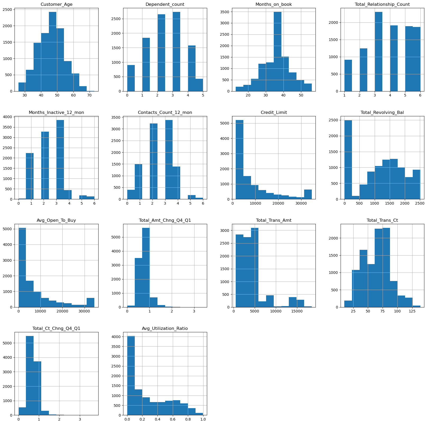
The following graphs visualises the distribution of data for all the numerical features in the dataset.
df_bankchurn.hist(figsize=(20,20))
plt.show()
Next, we will look at some correlations for the numerical features. As the Attrition_Flag is categorical, we will first transform this column by replacing ‘Attrited Customer’ with the value of 1 and ‘Existing Customer’ with the value of 0. We have also changed the column name to ‘target’ for easy reference. As we have made some changes to the dataset, we will make a copy so that we will always have the source file to return to if need be.
bankchurn_corr = df_bankchurn.copy()
bankchurn_corr.Attrition_Flag = bankchurn_corr.Attrition_Flag.replace({'Attrited Customer':1,'Existing Customer':0})
bankchurn_corr['target'] = bankchurn_corr['Attrition_Flag']
bankchurn_corr = bankchurn_corr.drop(["Attrition_Flag"], axis = 'columns')
corr = bankchurn_corr.corr(numeric_only = bool)
sns.heatmap(corr, linewidths=2, cmap='Greys')
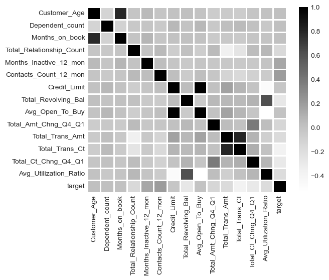
It appears Total_Trans_Ct, Total_Ct_Chng_Q4_Q1 an Total_Revolving_Bal have the highest negative correlation with ‘target’ while Contacts_Count_12_mon and Months_Inactive_12_mon have the highest positive correlation.
Let’s visualise the categorical features
fig, axarr = plt.subplots(2, 2, figsize=(20,12))
sns.countplot(x ='Education_Level', hue = 'target', data = bankchurn_corr, ax = axarr[0][0])
sns.countplot(x ='Marital_Status', hue = 'target', data = bankchurn_corr, ax = axarr[0][1])
sns.countplot(x ='Income_Category', hue = 'target', data = bankchurn_corr, ax = axarr[1][0])
sns.countplot(x ='Card_Category', hue = 'target', data = bankchurn_corr, ax = axarr[1][1])
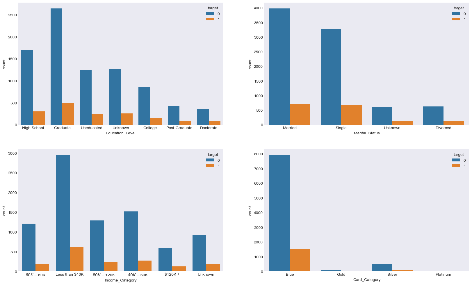
We know from earlier investigation that most of their customers chose to stay and continue using the credit card. However from the above charts, we can see that the majority of customers who chose to leave were earning less than $40k annually and that they were on the Blue card.
Balanced Random Forest
Due to the highly imbalance dataset, we will utlise the scikit-learn library within Python to model our data using a Balanced Random Forest. The code sections below are broken up into 3 key sections:
- Data Preprocessing
- Model Training
- Performance Assessment
Data Preprocessing
Unlike other classification models like Logistic Regression, a benefit of using Random Forest, including Balanced Random Forest, is that it is not susceptible to the effects of outliers or highly correlated input variables. However as there are a number of categorical independent variables in this dataset, these will need to be pre-processed. As an example, one of the categorical variables in the dataset is Gender where values are ‘Male’ or ‘Female’. The Random Forest algorithm can’t deal with data in this format as it can’t assign any numerical meaning to it when assessing the relationship between the Gender independent variable and the dependent variable. As gender doesn’t have any explicit order to it, in other words, Male isn’t higher or lower than Female and vice versa, one approach is to apply One Hot Encoding to this and all other categorical columns.
One Hot Encoding can be thought of as a way to represent categorical variables as binary vectors, in other words, a set of new columns for each categorical variable with either a 1 or a 0 saying whether that value is true or not for that observation. These new columns would go into our model as input variables and the original column is discarded.
We also drop one of the new columns using the parameter drop_first = True. We do this to avoid the dummy variable trap where our newly created encoded columns perfectly predict each other.
# One hot encoding for all categorical variables
bankchurn_corr = pd.get_dummies(bankchurn_corr, columns = ['Gender'],drop_first = True)
bankchurn_corr = pd.get_dummies(bankchurn_corr, columns = ['Education_Level'],drop_first = True)
bankchurn_corr = pd.get_dummies(bankchurn_corr, columns = ['Marital_Status'],drop_first = True)
bankchurn_corr = pd.get_dummies(bankchurn_corr, columns = ['Income_Category'],drop_first = True)
bankchurn_corr = pd.get_dummies(bankchurn_corr, columns = ['Card_Category'],drop_first = True)
Splitting the Data For Modelling
Let’s now shuffle the data and split our data into an X object which contain the independent variables and the y object that contains only our dependent variable. Once we have done this, we will split our data into training and test sets to ensure we can faily validate the accuracy of the predictions on data was not used in training. In this case, we have allocated 80% of the data for training, and the remaining 20% for validation. We will make sure to add in the stratify parameter to ensure that both our training and test sets have the same proportion of customers who did, and did not, churn - meaning we can be more confident in our assessment of predictive performance.
# shuffling the data first
bankchurn_corr = shuffle(bankchurn_corr, random_state = 42)

# Splitting data into X and y objects for modelling
X = bankchurn_corr.drop(["target"], axis = 1)
y = bankchurn_corr["target"]

# split out training & test sets
X_train, X_test, y_train, y_test = train_test_split(X, y, test_size = 0.2, random_state = 42, stratify = y)
Model Training
Instantiating and training our Balanced Random Forest model is done using the below code. We use the random_state parameter to ensure we get reproducible results, and this helps us understand any improvements in performance with changes to model hyperparameters.
We also look to build more Decision Trees in the Random Forest (300) than would be done using the default value of 100.
Lastly, as the dataset is imbalanced, we will specify the class_weight parameter to be ‘balanced’.
# instantiate our model object
brf = BalancedRandomForestClassifier(n_estimators = 300, random_state= 42, class_weight = "balanced")

# fit our model using our training & test sets
brf.fit(X_train, y_train)
Model Performance Assessment
Predict On The Test Set
We need to assess how well our model is predicting on new data - we use the trained model object (here called clf) and ask it to predict the Left variable for the test set.
In the code below we create one object to hold the binary 1/0 predictions, and another to hold the actual prediction probabilities for the positive class.
# predict on the test set
y_pred_class = brf.predict(X_test)
y_pred_prob = brf.predict_proba(X_test)[:,1]
Confusion Matrix
A Confusion Matrix provides us a visual way to understand how our predictions match up against the actual values for those test set observations.
The below code creates and plots the Confusion Matrix using the ConfusionMatrixDisplay functionality from within scikit-learn a
# creates and plots the confusion matrix
disp = ConfusionMatrixDisplay.from_predictions(y_test, y_pred_class, cmap = "coolwarm")
plt.title("Confusion Matrix")
plt.ylabel("Actual Class")
plt.xlabel("Predicted Class")
plt.show()
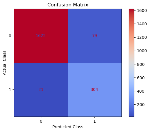
The aim is to have a high proportion of observations falling into the top left cell (predicted non-churners and actual non-churners) and the bottom right cell (predicted churners and actual churners).
Since the proportion of churners in our data was around 16:84 we will analyse the model accuracy not only using Classification Accuracy, but also Precision, Recall, and F1-Score as they will help us assess how well our model has performed from different points of view.
Classification Performance Metrics
Classification Accuracy
Classification Accuracy is a metric that tells us of all predicted observations, what proportion did we correctly classify. This is very intuitive, but when dealing with imbalanced classes, can be misleading.
An example of this could be a rare disease. A model with a 98% Classification Accuracy on might appear like a fantastic result, but if our data contained 98% of patients without the disease, and 2% with the disease - then a 98% Classification Accuracy could be obtained simply by predicting that no one has the disease - which wouldn’t be a great model in the real world.
In this example of the rare disease, we could define Classification Accuracy as of all predicted patients, what proportion did we correctly classify as either having the disease, or not having the disease
Precision & Recall
Precision is a metric that tells us of all observations that were predicted as positive, how many actually were positive
Keeping with the rare disease example, Precision would tell us of all patients we predicted to have the disease, how many actually did
Recall is a metric that tells us of all positive observations, how many did we predict as positive
Again, referring to the rare disease example, Recall would tell us of all patients who actually had the disease, how many did we correctly predict
The tricky thing about Precision & Recall is that it is impossible to optimise both - it’s a zero-sum game. If you try to increase Precision, Recall decreases, and vice versa. Sometimes however it will make more sense to try and elevate one of them, in spite of the other. In the case of our rare-disease prediction like we’ve used in our example, perhaps it would be more important to optimise for Recall as we want to classify as many positive cases as possible. In saying this however, we don’t want to just classify every patient as having the disease, as that isn’t a great outcome either!
So - there is one more metric which is actually a combination of both.
F1 Score
F1-Score is a metric that essentially “combines” both Precision & Recall. Technically speaking, it is the harmonic mean of these two metrics. A good, or high, F1-Score comes when there is a balance between Precision & Recall, rather than a disparity between them.
Overall, optimising your model for F1-Score means that you’ll get a model that is working well for both positive & negative classifications rather than skewed towards one or the other. To return to the rare disease predictions, a high F1-Score would mean we’ve got a good balance between successfully predicting the disease when it’s present, and not predicting cases where it’s not present.
Using all of these metrics in combination gives a really good overview of the performance of a classification model, and gives us an understanding of the different scenarios & considerations!
In the code below, we utilise in-built functionality from scikit-learn to calculate these four metrics.
# classification accuracy
accuracy_score(y_test, y_pred_class)

# precision
precision_score(y_test, y_pred_class)

# recall
recall_score(y_test, y_pred_class)

# f1-score
f1_score(y_test, y_pred_class)
Running this code gives us:
- Classification Accuracy = 0.951 meaning we correctly predicted the class for 95.1% of the test set observations
- Precision = 0.794 meaning that for our predicted leavers, we were correct 79.4% of the time
- Recall = 0.935 meaning that of all actual leavers, we predicted correctly 93.5% of the time
- F1-Score = 0.859
Feature Importance and Permutation Importance
Random Forests are an ensemble model, made up of many, many Decision Trees, each of which is different due to the randomness of the data being provided, and the random selection of input variables available at each potential split point.
Because of this, we end up with a powerful and robust model, but because of the random or different nature of all these Decision trees - the model gives us a unique insight into how important each of our input variables are to the overall model.
As we’re using random samples of data, and input variables for each Decision Tree - there are many scenarios where certain input variables are being held back and this enables us a way to compare how accurate the models predictions are if that variable is or isn’t present.
So, at a high level, in a Random Forest, we can measure importance by asking How much would accuracy decrease if a specific input variable was removed or randomised?
If this decrease in performance, or accuracy, is large, then we’d deem that input variable to be quite important, and if we see only a small decrease in accuracy, then we’d conclude that the variable is of less importance.
One way of doing this is called Feature Importance. This is where we find all nodes in the Decision Trees of the forest where a particular input variable is used to split the data and assess what the gini impurity score (for a Classification problem) was before the split was made, and compare this to the gini impurity score after the split was made. We can take the average of these improvements across all Decision Trees in the Random Forest to get a score that tells us how much better we’re making the model by using that input variable. If we do this for each of our input variables, we can compare these scores and understand which is adding the most value to the predictive power of the model.
The other approach, often called Permutation Importance cleverly uses some data that has gone unused at when random samples are selected for each Decision Tree (this stage is called “bootstrap sampling” or “bootstrapping”)
These observations that were not randomly selected for each Decision Tree are known as Out of Bag observations and these can be used for testing the accuracy of each particular Decision Tree.
For each Decision Tree, all of the Out of Bag observations are gathered and then passed through. Once all of these observations have been run through the Decision Tree, we obtain a classification accuracy score for these predictions.
In order to understand the importance, we randomise the values within one of the input variables - a process that essentially destroys any relationship that might exist between that input variable and the output variable - and run that updated data through the Decision Tree again, obtaining a second accuracy score. The difference between the original accuracy and the new accuracy gives us a view on how important that particular variable is for predicting the output.
Let’s examine both Feature and Permutation Importance:
# calculate feature importance
feature_importance = pd.DataFrame(brf.feature_importances_)
feature_names = pd.DataFrame(X.columns)
feature_importance_summary = pd.concat([feature_names,feature_importance], axis = 1)
feature_importance_summary.columns = ["input_variable","feature_importance"]
feature_importance_summary.sort_values(by = "feature_importance", inplace = True)

# plot feature importance
plt.figure(figsize = (8,8)
plt.barh(feature_importance_summary["input_variable"],feature_importance_summary["feature_importance"])
plt.title("Feature Importance of Balanced Random Forest")
plt.xlabel("Feature Importance")
plt.tight_layout()
plt.show()
The above code gives us the plot as seen below:
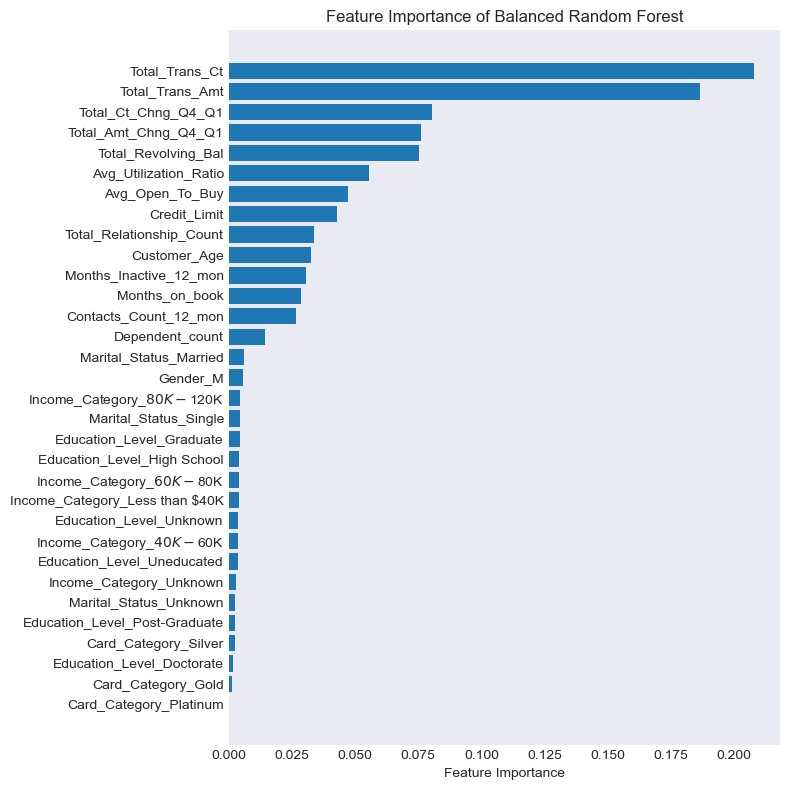
It appears that Feature Importance is flagging that Total_Trans_Ct, Total_Trans_Amt, Total_Ct_Change_Q4_Q1 an Total_Amt_Chng_Q4_Q1 are the most important drivers of customer churn.
So what will Permutation Importance flag as the most important drivers?
# BRF permutation importance
result = permutation_importance(brf, X_test, y_test, n_repeats = 10, random_state = 42)

# plotting the chart
permutation_importance = pd.DataFrame(result["importances_mean"])
feature_names = pd.DataFrame(X.columns)
permutation_importance_summary = pd.concat([feature_names,permutation_importance], axis = 1)
permutation_importance_summary.columns = ["input_variable", "permutation_importance"]
permutation_importance_summary.sort_values(by = "permutation_importance", inplace = True)

plt.figure(figsize =(8,8))
plt.barh(permutation_importance_summary["input_variable"], permutation_importance_summary["permutation_importance"])
plt.title("Permutation Importance of Balanced Random Forest")
plt.xlabel("Permutation Importance")
plt.tight_layout()
plt.show()
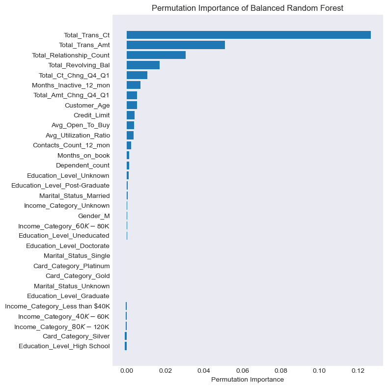
The overall story from both approaches appears to be fairly similar. Permuation Importance is also flagging that the top 2 drivers were Total_Trans_Ct and Total_Trans_Amt but it thinks the 3rd and 4th key drivers were the number of products the customer has with the bank (Total_Relationship_Count) and the total revolving balance the customer has on the credit card (Total_Revolving_Bal)
Permutation Importance is often preferred over Feature Importance as the latter can at times inflate the importancea of the dataset’s numerical features. Both are however useful, and in most cases will give fairly similar results.
Further Exploratory Analysis
Now that we have the top key drivers that influence customer churn, let’s look at the relationship between each of these variables with the the target variable and see if we can spot further trends.
Total Transaction Count
plt.figure(figsize=(15,6))
plt.style.use('seaborn-v0_8-dark')
plt.grid(True, alpha = 1)
sns.kdeplot(bankchurn_corr.loc[bankchurn_corr['target'] == 1, 'Total_Trans_Ct'], label = 'Attrited Customers')
sns.kdeplot(bankchurn_corr.loc[bankchurn_corr['target'] == 0, 'Total_Trans_Ct'], label = 'Existing Customers')
plt.xlabel('Total Transaction Count')
plt.xlim(left=10, right=140)
plt.ylabel('Density')
plt.title('Total Transaction Count - Attrited vs Existing Customer')
plt.legend()
Total Transaction Amount
plt.figure(figsize=(15,6))
plt.style.use('seaborn-v0_8-dark')
plt.grid(True, alpha = 1)
sns.kdeplot(bankchurn_corr.loc[bankchurn_corr['target'] == 1, 'Total_Trans_Amt'], label = 'Attrited Customers')
sns.kdeplot(bankchurn_corr.loc[bankchurn_corr['target'] == 0, 'Total_Trans_Amt'], label = 'Existing Customers')
plt.xlabel('Revolving Balance')
plt.xlim(left=500, right=18500)
plt.ylabel('Density')
plt.title('Total Transaction Amount - Attrited vs Existing Customer')
plt.legend()
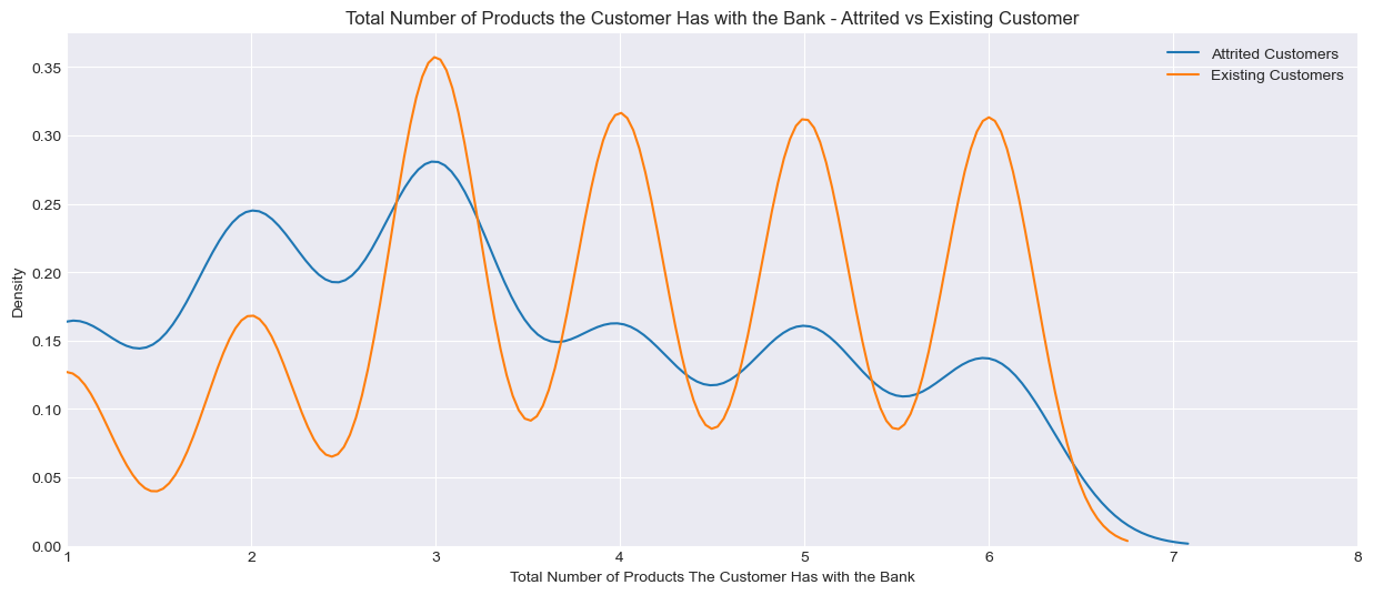
Total Number of Products the Customer has with the Bank (Total_Relationship_Count)
plt.figure(figsize=(15,6))
plt.style.use('seaborn-v0_8-dark')
plt.grid(True, alpha = 1)
sns.kdeplot(bankchurn_corr.loc[bankchurn_corr['target'] == 1, 'Total_Relationship_Count'], label = 'Attrited Customers')
sns.kdeplot(bankchurn_corr.loc[bankchurn_corr['target'] == 0, 'Total_Relationship_Count'], label = 'Existing Customers')
plt.xlabel('Total Number of Products The Customer Has with the Bank')
plt.xlim(left=1, right=8)
plt.ylabel('Density')
plt.title('Total Number of Products the Customer Has with the Bank - Attrited vs Existing Customer')
plt.legend()
Total Revolving Balance
plt.figure(figsize=(15,6))
plt.style.use('seaborn-v0_8-dark')
plt.grid(True, alpha = 1)
sns.kdeplot(bankchurn_corr.loc[bankchurn_corr['target'] == 1, 'Total_Revolving_Bal'], label = 'Attrited Customers')
sns.kdeplot(bankchurn_corr.loc[bankchurn_corr['target'] == 0, 'Total_Revolving_Bal'], label = 'Existing Customers')
plt.xlabel('Revolving Balance')
plt.xlim(left=0, right=3000)
plt.ylabel('Density')
plt.title('Total Revolving Balance - Attrited vs Existing Customer')
plt.legend()
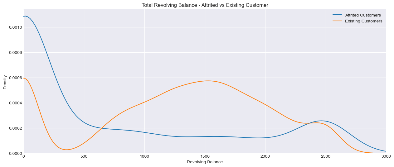
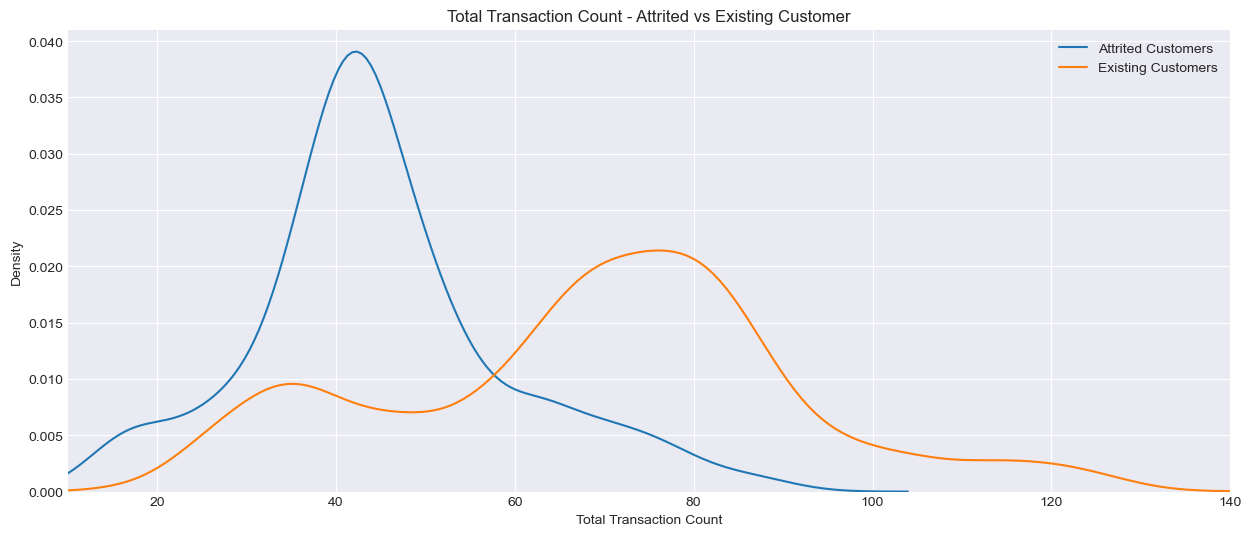
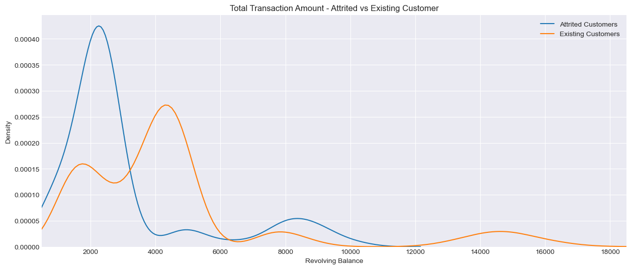
In the charts above, Density on the y-axis represents the relative concentration of customers at different levels of x-axis. For example in the chart titled ‘Total Transaction Count - Attrited vs Existing Count - the higher the density at a given transaction count, the more customers (either attrited or existing) fall within the range. Unlike a histogram which shows raw count, density does not represent absolute numbers but rather the proportion of customers in each category. This smooths out the distribution of data to show trends more clearly.
It appears that customers who leave the credit card service with the bank have fewer transaction counts as well as lower transaction amounts spent on the card. They also tend to have fewer products with the bank and a lower revolving balance.
Application
We now have our findings as well as our model object to share with the client. As transacton count and transaction amount are the top 2 drivers of customer churn, we would recommend the client to explore the possibility of engaging in targeted promotions or cashback offers to incentivise usage. Offering bundled products (e.g. discounted insurance for credit card holders) can also encourage customers to hold more products with them, the latter being the third driver of predicting customer churn.
We also now have the required pre-processing steps to use this model for the next time the company receives new customer data. When this is ready to launch we can feed the neccessary customer information, obtaining predicted probabilities for each customer leaving.
Growth & Next Steps
While predictive accuracy was relatively high - other modelling approaches could be tested, especially those somewhat similar to Random Forest, for example XGBoost, LightGBM to see if even more accuracy could be gained.
We could even look to tune the hyperparameters of the Random Forest, notably regularisation parameters such as tree depth, as well as potentially training on a higher number of Decision Trees in the Random Forest.
From a data point of view, further variables could be collected, and further feature engineering could be undertaken to ensure that we have as much useful information available for predicting customer churn.